
Many companies consider the Net Promoter Score their most important customer metric. In the first article in the series we saw how NPS, created 20 years ago, grew in popularity and turned into the default tool to measure customer-sentiment and to collect customer feedback.
But many experts doubt that NPS is indeed the right tool for these purposes. Some question the logic and science behind it. Many feel that usage and purchase metrics may be more representative of customer sentiment.
In this article we’ll take a closer look at NPS and each of its parts. By the end of the article you should have a firm idea what you should keep and what you should consider dumping (spoiler: a whole lot).
I apologize in advance — this is going to be an unusually long and fairly technical article. But if you’re using NPS in any way, you should know what I’m about to tell you.
The Survey
NPS is based on a user survey. Surveys have a place in research, but they produce only weak evidence. One issue has to do with response rates and sampling biases. According to one study the average NPS survey response rate (in B2B) is 13%. User research expert Jared M. Spool puts the number at 4%-7%. Spool explains that “One reason for low response rates is people you’ve frustrated probably won’t bother giving you feedback” i.e. the survey can create a strong positive bias.
Rob Markey, one of the official co-leads of NPS indeed confirms that there NPS surveys create a bias:
Experience shows that in any given population of customers from whom feedback is requested, the most likely responders are drawn from the ranks of Promoters. The least likely to respond are the Detractors. We have observed this response bias in almost every study we have done.
Rob Markey | Medium 2017
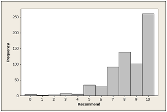
Distribution of 673 responses to the “Likelihood to Recommend” question for a consumer software product source:Jeff Sauro | MeasuringU
Jared Spool points at another potential weakness of the NPS survey: “To really game the score, encourage detractors to drop out early.” A case in point comes from a well known company, who tested placing a customer support phone number above the NPS question. This change caused a double-digit improvement in the NPS score, perhaps because the detractors were more likely to call the phone number than complete the survey. This example illustrates both how sensitive the NPS survey is to context, and the fact that many “detractors” may in fact be people momentarily in need of assistance.
These limitations are probably true to all types of satisfaction surveys, but are not an issue with usage and purchase metrics that are typically not sampled.
Join thousands of people who receive to articles like this (plus eBooks, templates and other resources) in their inbox via my newsletter
“Likelihood to Recommend” Question
The creators of the Net Promoter Score chose the question “How likely are you to recommend [X] to a friend or a colleague” because it best correlated with purchases and recommendations out of 20 questions they tested. However today we use NPS mostly to gauge customer sentiment — how much they like the product or company, how satisfied they are. Is this still the right question?
Some user researchers claim that “Likelihood to recommend” is affected by context: the type of product or company, the people that come to your mind, as well as by recency effects:
NPS captures just one point in time with a customer, and the customer’s response will depend heavily on their most recent experience. — UserTesting
One Stanford university study suggests that the question “how likely are you to recommend [X]” produces very similar results to asking “how much do you like [X]” and “how satisfied are you with [X]”.
My guess (caveat: not a user researcher) is that “How likely are you to recommend” is fine as it brings to mind a concrete action for the respondent to consider. The answers may not predict actual recommendations, but I’m guessing they are correlated with satisfaction and positive attitude towards the subject of the question.
The NPS Scale
The NPS survey uses an abnormally large 11-point Likert scale: from 0 to 10. Most Likert questions use 5 or 7 points. Adding more points to the scale can make it harder for the respondent to choose, and may generate information that isn’t really there (do people really differentiate between a 6 and a 7 in the question “how likely are you to recommend?” )
The Stanford university study mentioned above found that NPS surveys with a 7-point scale performed better than surveys with an 11-point scale at measuring satisfaction and recommendations.
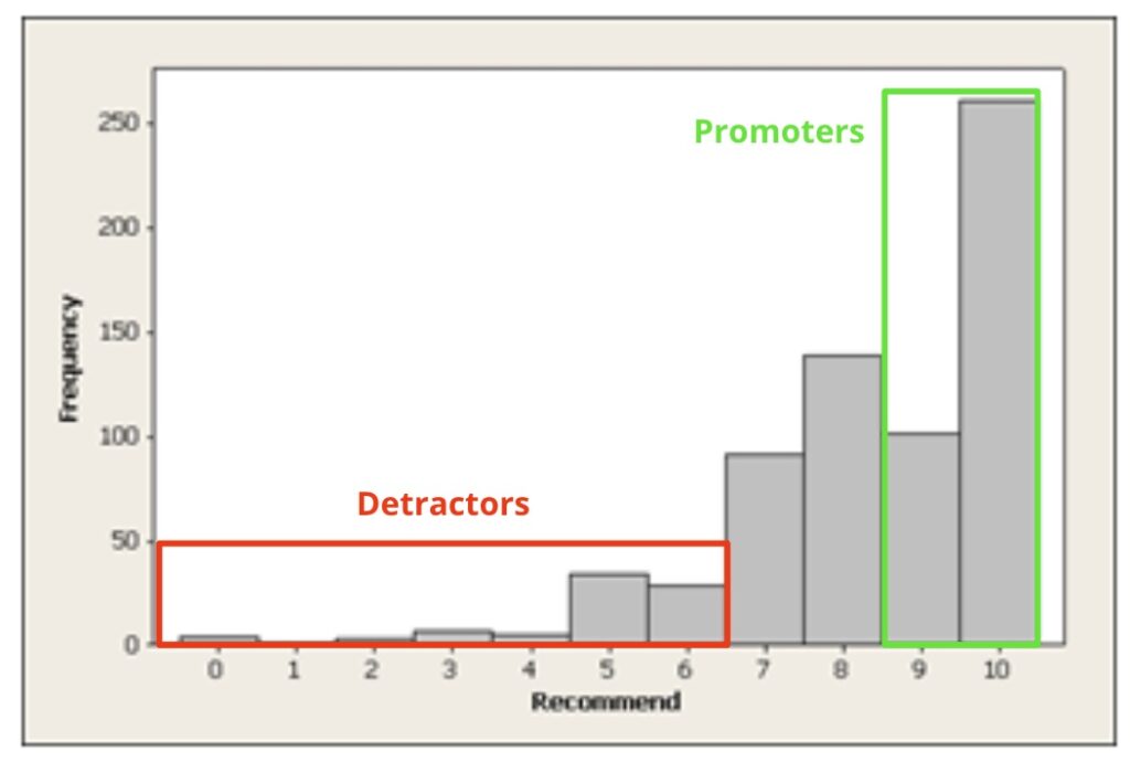
Detractors vs. Passives vs. Promoters
The Net promoter score differentiates between three groups of respondents: Detractors (0-6), Passives (7-8), and Promoters (9-10). The creators of NPS chose these buckets based on analysis of the open comments people left on early NPS surveys and of actual recommendations they made (self-reported). According to the research (which was not peer-reviewed) 80% of the negative word of mouth comments came from those who responded 0-6, and 80% of customer referrals came from those who responded 9-10.
I couldn’t find much research to confirm or refute this part of NPS. MeasuringU, a research firm specializing in user research and surveys, ran a study that suggests that respondents who score 0-6 (Detractors) are indeed much more likely to post negative comments on social media, but it didn’t find a strong distinction between the so-called Passives and Promoters.
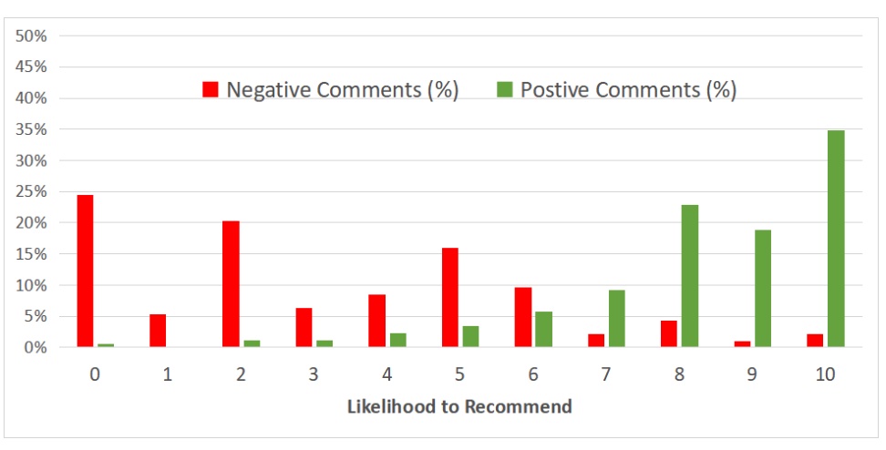
Negative and positive scores per NPS responses. Source: MeasuringU
The division into Detractors, Passives, and Promoters is based on a theory that NPS inventor Fred Reichhert was proposing, in which business success depends on positive word of mouth. Likelihood-to-recommend is therefore considered the most reliable predictor of growth.
To my knowledge this theory has never been proven, and in fact multiple studies have shown that NPS scores do not predict growth. Today we see recommendations as one factor out of many in business success (in fact, the most viral products, for example Facebook or Slack, don’t rely on word-of-mouth but on organic spread through usage). Our current theory of the world is that if there’s one thing that is most likely to drive growth it is customer value. It is this, I believe, that companies are trying to measure today with NPS. However NPS, at best, measures customer sentiment (satisfaction), which isn’t quite the same as value. The value users derive from your product or service can be more directly deduced from usage and purchase metrics.
When we look at NPS as a gauge of customer satisfaction, the terms Detractors, Passives, and Promoters stop making sense. The split of the scale also differs sharply from the conventions of the industry.

Example: Satisfaction buckets in tripadvisor.com
Most satisfaction surveys consider middle scores (5-6 in NPS) as neutral while NPS sees them are negative. A score of 8 out 10 would be broadly considered positive, while NPS considered it as neutral. Most counterintuitive of all is that NPS doesn’t differentiate between a person who responds with a 6 and one who responds with a 0.
But there was one major benefit for the division into Detractors/Passives/Promoters— it created a simple and compelling narrative. Here’s Fred Reichhert’s explanation from the 2003 The One Number You Need to Grow:
[N]ot only did clustering customers into three categories—promoters, the passively satisfied, and detractors—turn out to provide the simplest, most intuitive, and best predictor of customer behavior; it also made sense to frontline managers, who could relate to the goal of increasing the number of promoters and reducing the number of detractors more readily than increasing the mean of their satisfaction index by one standard deviation.
The One Number You Need to Grow | Fred Reichhert, HBR
In other words, the Promoters vs. Detractors’ narrative (especially with these emotionally-charged names) made the results more vivid and moving, a classic good guys vs. bad guys story if you like.
This may explain the counterintuitive split of the scale. As NPS survey responses tend to skew towards the higher scores, breaking the scale into 3 relatively even buckets, say 0-2, 3-7, 8-10, would make the Promoters “win” almost every time. To make it more of a fair fight the inventors of NPS “normalized” the scale by carving out only the 9-10 as “true positives” and counting a whopping 7 out of the 11 points off the scale as negatives.
I’m not suggesting that Reichhert and his team deliberately skewed their research to create dramatic results. This bucketing probably makes sense in the worldview where recommendations are the key to success. However when it comes to customer satisfaction this bucketing scheme is quite unusual and controversial. There are likely more elegant ways to express the relationship between the top-most and bottom-most results without disregarding the 8’s or lumping the 5’s and 6’s into the “bad guys” camp.
In the Lean Product Management workshops we practice using principles, frameworks and tools that bring modern product management thinking into any org.
Secure your ticket for the next public workshop or contact me to organize an in-house workshop for your team.
The “Wacky” NPS Metric
The NPS metric attempts to aggregate the results into one simple-to-understand number. Simply calculating the mean would disregard the Promoters vs. Detractors division that is so central to the NPS narrative. Charting the three buckets or their ratios would be the natural answer, but would probably not create a clear and compelling number to show executives. So Reichheld and his team landed on this formula:
NPS Score = % Promoters – %Detractors
The NPS metric is therefore a number in the range -100% to 100% (today most people drop the %).
Subtracting percentages is a very uncommon way to create a metric. In articles, quite a few data scientists referred to this metric as “weird” or “wacky”. However, again the benefit is having a number that is easy to relate to. It’s clear that a company that has an NPS of 35 is doing much better than one that got -20. And if that company is achieving , say, NPS of 38 in the next quarter, it’s likely doing something right (I’ll show shortly why this second statement is likely wrong).
But this improvement in communication comes with some very serious tradeoffs.
Loss of information
As data scientist Colin Fraser explains in this article, the bucketing and the subtraction that go into the calculation of the NPS metric cause it to lose a lot of information. Big changes in the data may not be reflected in the NPS metric. Below are a couple of theoretical examples from Fraser’s article:
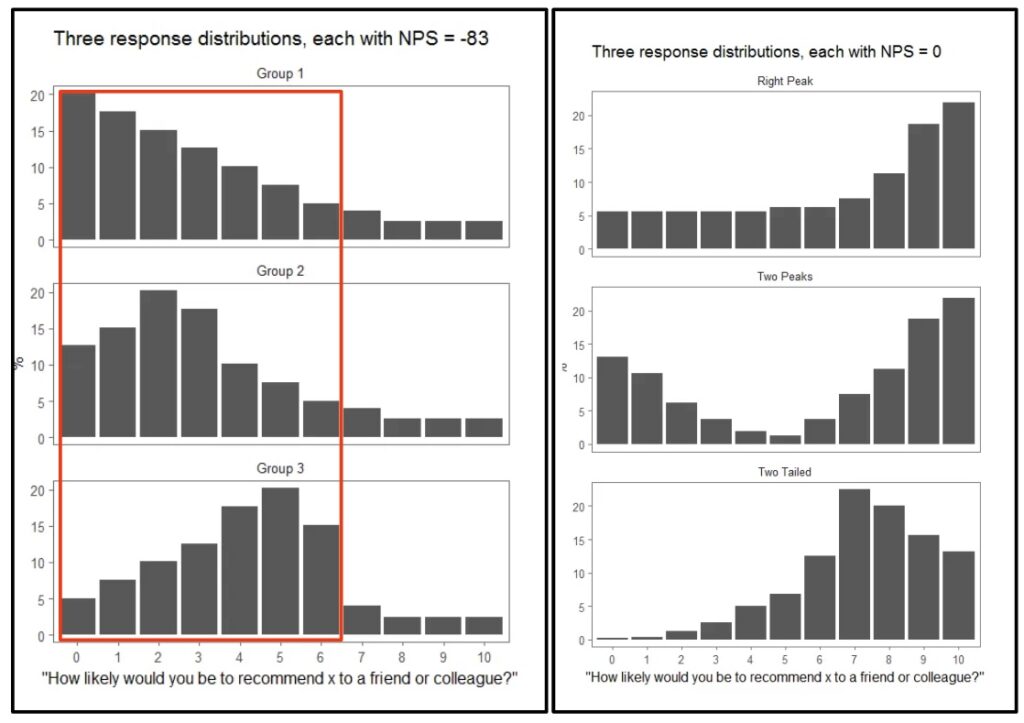
The response distribution on the left all produce the same net promoter score of -83. Similarly the three on the right all produce a 0.
Source: Colin Fraser
In the example on the left the NPS number misses some major changes that happen within the range 0-6, because these results are all bucketed together as Detractors. The example on the right shows dramatic distribution changes across all three buckets which are not caught by the formula %Promoter – %Detractors.
On the other hand the NPS metric is sensitive to relatively minor changes across bucket cliffs. User research expert Jared spool gives a theoretical example where all responses land on 8. The net promoter score will be 0 (which doesn’t sound like a very appropriate score for such a good result). However if you’re able to move everyone to score 9 instead, the score will jump to the maximum — 100. A relatively minor change in votes creates a massive uptick in score.
These are artificial examples, and it’s possible that the NPS formula works well with the regular right-skew distribution of survey results. I’d still argue that even in these cases the NPS number you get may be somewhat arbitrary. As Colin Frasser explains:
Any summary statistic necessarily throws out a lot of information about the distribution that it summarizes, but the NPS throws out a lot, much of which would not be lost using other similar summary statistics.
Colin Fraser | Medium
Weak Statistical Properties
The NPS metric is a statistic. It helps us predict the properties of the full population of customers, namely how satisfied they are, based on the sample collected in the survey. However the way the NPS metric is calculated — subtracting %Detractros from %Promoters — causes it to have high variance compared to most other summary statistics (see Colin Fraser’s article for a technical explanation).
Image source: Investopedia
To put this into simple terms, let’s say you run ten consecutive NPS surveys and for each you calculate the NPS metric. What you’re likely to see is that the ten NPS numbers you get will spread across a relatively wide range of values compared to say the survey means (just averaging the responses). On average, each NPS metric you calculate is likely to be less representative of the true NPS metric of the entire population (what you would get if you surveyed 100% of your users).
Another way to say this is that if you start showing NPS scores with error margins (something almost no one is doing) those margins will be quite wide. So wide, in fact, that most of the changes you’re likely to see month-over-month or in-between cohorts will turn out to be in the noise.
To make the NPS metric more trustworthy you need rather large sample sizes. A/B experimentation expert Ronny Kohavi calculated that to conduct an A/B experiment that measures a change of 5 points in the NPS metric with 95% statistical significance and 80% power (the industry norms) you’ll need 3,840 responses for each variant — A and B — or a total for 7,680 survey responses. Assuming a response rate of 4%-12%, means you’ll have to send the survey to 60,000-192,000 customers. Kohavi therefore concludes that the NPS metric is mostly irrelevant for experimentation:
I believe that one cannot realistically survey such large populations regularly every few weeks when experiments run, as it will cause survey fatigue; behavior metrics that are automatically collected in A/B tests are likely to be better for most organizations.
Ronny Kohavi, LinkedIn 2023
Open Feedback Questions
Some NPS surveys come with open questions such as “What’s the main reason for your score?” This part of NPS seems to be the least contentious and the most valuable. Product people I speak with tell me they regularly find useful information there, especially when looking at what “detractors” are reporting. Some product teams regularly scour the NPS feedback as part of their user research.
This essentially makes NPS a feedback collection tool, but there are many other feedback tools in the market to choose from, and many offer stronger data collection and analysis abilities. I’m also unsure if the question “How likely are you to recommend” is the best trigger to solicit open feedback.
Conclusions: How I recommend Using NPS
Based on this research (and with the caveat caveat and I’m not an expert at user surveys), here’s what I’d recommend if you’re considering using NPS:
- Treat NPS surveys as a way to gauge user sentiment/satisfaction, rather than recommendation, and a fairly inaccurate one at that.
- Keep the question “How likely are you to recommend [X]” where X is a product or service
- Switch to a 5-point or 7-point scale. I personally prefer five points for simplicity and clarity.
- Stop using the terms Detractor, Passive, and Promoter. They belong to a bygone theory that was never proven.
- Stop using the 0-6, 7-8, 9-10 buckets. These too seem very questionable. If you use a 5-point scale, you can treat each value in the range 1-5 as its own bucket, or you can split and aggregate in whatever way that makes sense to you (looking at the open feedback can help draw the lines).
- Don’t use the NPS metric (%Promoters – %Detractors). Instead you can track the mean (average) of the responses, or chart the percentage of each of your response buckets. A data scientist/analyst can probably suggest many other ways to analyze and visualize the results
- Show error margins. This will help avoid wrong conclusions derived from noise.
- Don’t use the metric as a key result in your OKRs, as an A/B experiment metric, or try to directly influence it — too many factors go into user satisfaction and it’s not actionable on its own.
- Individual scores may be affected by some one-of phenomenon (a promotion, a major issue) and by seasonality. The trends over time are much more important.
- In general rely much more on measurable user behaviors (usage, retention, purchases…) to sense how much value your users are getting, and on qualitative research (interviews, observational studies etc) to understand what your customers are thinking. You can use a satisfaction survey (such as NPS) as a supplemental health metric you run every quarter or two, but this should never be your top customer metric.
Final Thoughts
I rarely do this type of deep-dive analysis of methodologies, but NPS with its near-ubiquitous presence and its quasi-scientific origins made for an interesting case study. The bigger point here is that there are hundreds, maybe thousands of frameworks, processes, and models on offer. Anything from open-space sitting, to prioritization techniques, to agile development methods. Some, like NPS, have become industry standards. Their origins have been forgotten and they are no longer questioned.
It’s okay to test a new methodology, but we should remember (and I’m saying this as someone who creates models and methodological tools) that there’s no rigorous science behind them. We should stay skeptical and form our own opinions whether the methodology is doing what it’s supposed to do. Based on the results we see we should feel free to keep using the methodology as suggested, modify it, or outright dump it. .
Acknowledgments
This article was written largely based on the research and publications of the following folks:
Cover photo by ROMBO